

How to draw a line chart in Excel 2013
- 24-07-2022
- trienkhaiweb
- 0 Comments
When using Excel, you want to turn a table of data into a chart to be more beautiful and easy to follow, you need to draw a chart in Excel. Line charts in Excel, also known as line charts, help us to see the fluctuations of data over time. In this article, I will guide you to draw this chart simply and quickly.

The article consists of 2 parts:
- Draw a line chart in Excel 2013
- Shows the value of the data on the line of the chart.
Mục lục
1. Draw a line chart in Excel 2013
I have a simple data table as follows:

To draw a line chart you just need to follow these steps:
- Step 1: Select the data area to be charted by highlighting the entire data area.

- Step 2: You look up, select Tab insert and select Line chart type, then left-click on the chart type you want.
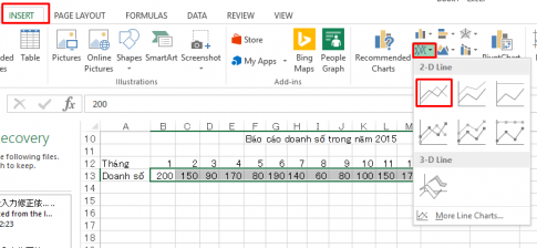
- Step 3: You have the following chart results:
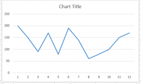
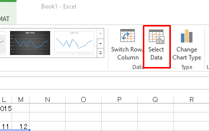
You left click on the chart to select the chart. You look up and select Select Data
- Step 4: Select Data Source dialog box. You choose Series 1 then select Edit.
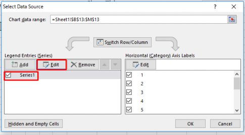
- Step 5: The Edit Series dialog box appears, enter the name of the table data. Here is Sales 2015. You click OK.
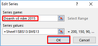
Back in the Select Data Source dialog box, click Ok. So you've got a chart like this:
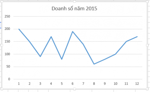
2.Show the value of the data on the line of the chart.
In part 1, I showed you how to create a line chart in Excel 2013. In this part, I will guide you to show the value of data on the line of the chart.
Right-click on the line and select Add data labels.
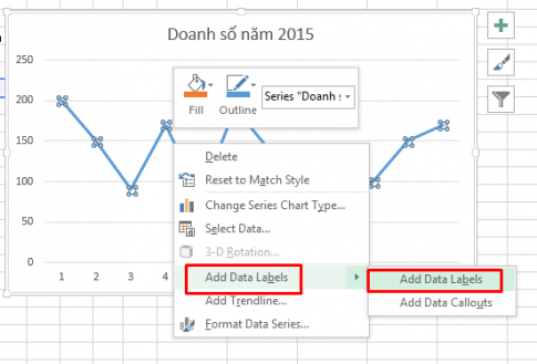
You have now displayed a full-value chart. Let's see the results:
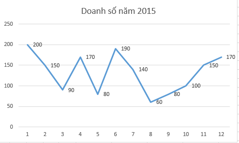
Conclusion: In this article, I have guided you to draw a graph in a simple Excel 2013. When working with a lot of data that needs statistics and can be displayed more clearly, charting is very necessary. Hope this article can be of help to you.
Good luck.


