

Instructions for drawing pie charts in Excel 2013
- 24-07-2022
- trienkhaiweb
- 0 Comments
When using Excel, there is a lot of data that you need to represent in a chart. Excel supports you with many types of charts to represent your data such as pie charts, bar charts, line charts. In this article, I will guide you to draw a pie chart.

Here, I guide you to draw a pie chart on Excel 2013. However, if you use Excel 2007, 2010, 2016, the method is similar.
For example, you have a table of sales data by 3 regions of a company, you want to draw a pie chart to show the sales ratio of each region.
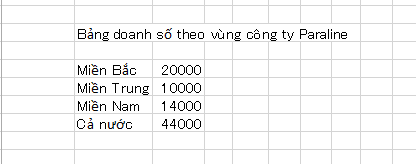
To draw a pie chart on Excel 2013, you need to follow these steps:
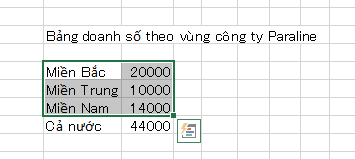
- Step 1 : You black out the data area containing the sales of 3 North Central South regions:
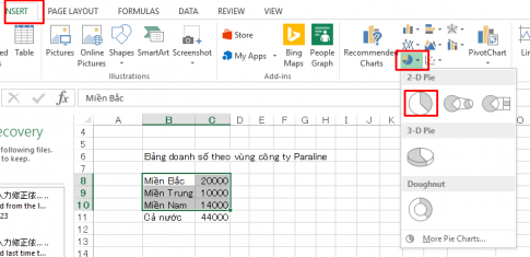
- Step 2: You look up, select the Insert tab then choose Pie and select the desired pie chart.
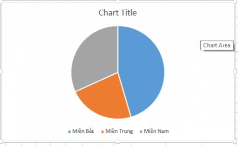
The chart will be displayed as follows
- Step 3: Click on the chart above and select Select Data
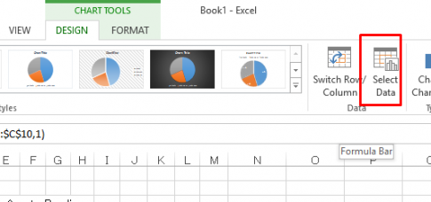
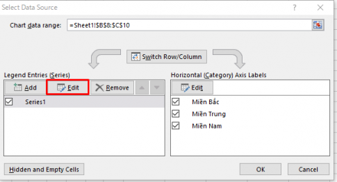
- Step 4: Select Data Source dialog box appears, select Series1 and click Edit
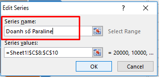
- Step 5 : The edit series name dialog box appears, enter your name and click ok
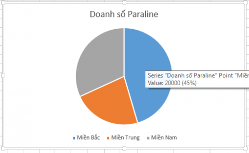
Back in the Select Data Source dialog box, click OK. The chart name will be displayed as follows:
- Step 6: Right-click on the chart and select Add data labels
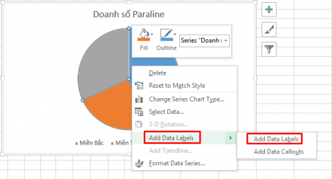
Sales will be displayed on the chart. However it is showing as actual sales.
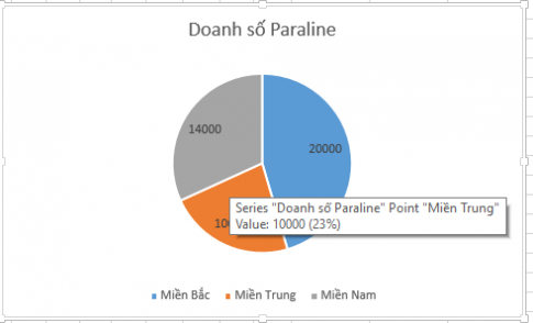
You want to convert this sales to %, you do the following:
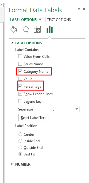
Right-click on the circle and select Format Data labels.
The Format Data Labels dialog box appears for you to choose from. You uncheck Value and choose as shown below:
So you have completed drawing a figure chart showing the number of businesses of Paraline company in 3 regions. Now let's see the results:
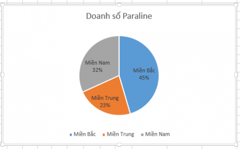
Conclusion: The above article has guided you to draw a pie chart in Excel 2013. When you have tabular data showing sales, drawing a pie chart will help you determine the ratio of each division. This is useful for comparing data. Hope this article will be useful to you.
Good luck.


