
Introduction to chart types in Excel 2013
- 24-07-2022
- trienkhaiweb
- 0 Comments
When using Excel, you have data that you want to represent graphically. A histogram is a visual representation of numeric values. Excel supports you with many types of charts to display the data to make it easier for you to understand the meaning of the numbers. In this article, I will introduce you to some charts of Excel 2013.

The article consists of 4 parts
- Column chart
- Line chart
- Pie . chart
- Some more charts
Mục lục
1. Column chart
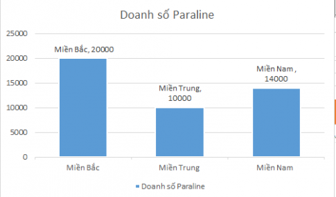
Column charts show data changes over time or a comparison of items. Data arranged in columns or rows on a spreadsheet can be plotted with a column chart. Column charts typically show categories on a horizontal axis and values along a vertical axis.
The following types of column charts are available:
– Inter-cluster column
– Stacked columns
– 100% stacked columns
2. Line chart
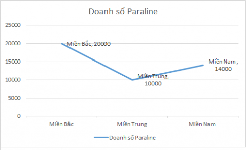
Line charts show trends in the data. Data arranged in columns or rows on a spreadsheet can be plotted with a line chart.
The following types of line charts are available:
– Roads and roads with markings
– Marked stacking and stacking lines
– 100% stacked line and 100% stacked line with marking.
3. Pie Chart ( Pie Chart )
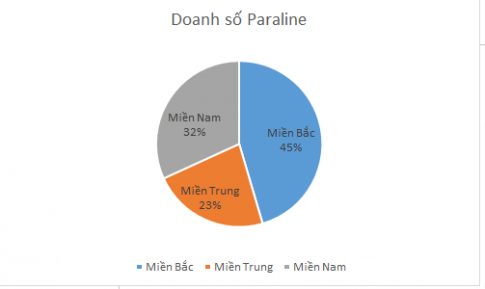
The pie chart shows the contributions of the subjects and the population, comparing them to each other. You can use this chart to highlight an important object in your data.
Some notes when using pie charts:
– You have only one data series
– No value in your data is negative and zero
– There are no more than seven categories, and all of these categories represent a fraction of the value of the entire circle.
4. Some other charts
– Bar: A bar chart is a horizontal version of a bar chart, used to compare objects with each other.
– Area : Area chart showing the change in magnitude over time.
– XY Scatter : Scatter chart (xy) showing relationships in numerical values of a series of data.
Stock : A stock chart (technical chart) is commonly used for stock price data, but can also be used for scientific data (like temperature changes).
– Surface : A face chart is useful when you want to find the optimal connection between two sets of data. As in topographic maps, the colors and patterns show what extent or region the area is in.
– Radar: A chart used to compare the aggregated values of a data area. Thereby showing the change of before and after the process.
Conclusion: In this article, I have introduced you to some charts of Excel 2013. Hopefully this article will help you have an overview and how to use charts properly.
Good luck !!


