
Instructions for editing and editing content in WordPress
- 24-07-2022
- chuong xuan
- 0 Comments
- Lesson number: 3
- Year made: 2018
- Video tutorial: No
- Belonging to the project: A Beginner's Guide to Using WordPress
In a previous article, I showed youhow to publish a new post in WordPress , but it is only an overview, merely related to publishing content to the website and there are no detailed instructions. to edit and present comprehensive content. This article was born to make up for that shortcoming.
Editing and presenting good content is a very effective, low-cost way of adding value, benefiting readers, and playing an important role in writing standard SEO articles .
The default WordPress post layout looks like this:
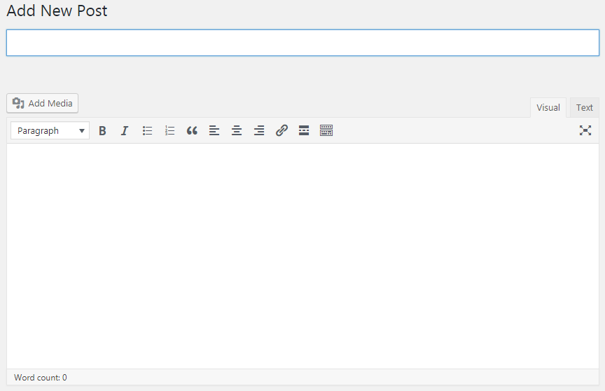
Right below the word Add New Post is the title of the post. And the wide white space below is the main content.
Along with Paragraph, above the body and below the title are options for editing:
Bold
Italicized
The dotted list looks like this:
- A
- REMOVE
- OLD
Numeric list:
- A
- REMOVE
- OLD
Quote:
I told you already. WordPress is great.
Left alignment
Center align
Right alignment
And finally a link to another page.
There are some more features if you tap the outermost icon, but overall, it still lacks what most people need.
To extend the capabilities of the editor, you need to install a plugin called TinyMCE Advanced.
You will see the editor interface change immediately after activation:

And I will use it to guide you in this article.
Start from top to bottom.
Mục lục
1. Title
How to choose a title can be described in three brief rules as follows:
- Exactly: according to what you wrote, it is not possible to “hang the head of a goat and sell dog meat”. Because at most, you can only “sell” once.
- Compelling: same gist, but writing catchy headlines will help you attract more readers. After all, if they don't find the headline compelling enough, they won't click = unread content = 95% wasted effort.
- Consider SEO factors related to the title : like character length (about 60 to not get truncated on search engine results) & must have the main keyword you intend to SEO.
2. Static path
As soon as you title the post, the editor automatically creates a static link (permalink) for the post that looks like this:

This static path is usually quite long and you need to click Edit to edit it to optimize it. Make it short (under 5 words) and contain the most important keywords.
For example, I edited as below (after editing, click OK):

This part I talked about in great detail in the article: URL Structure for WordPress.
3. Add Media

Used to add images to posts. If you need to add an image to any part of your article, leave your mouse pointer there, then click Add Media and then click Choose File to select an image from your computer:
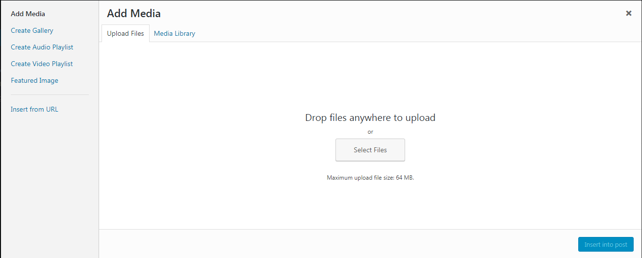
After the photo upload is successful, you will see the following image on the right hand side:
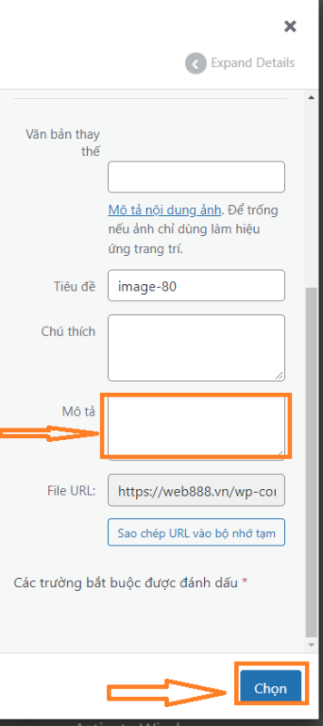
In Alt Text, you must never forget to add a descriptive image, otherwise it will be bad for SEO (search engine optimization). For example, let's say the image you upload is about the book Nang Doc Diamond for example, where the Alt Text you need to enter: clip diamond.
If Alt is used exclusively for SEO (search engines) then the Caption/Caption section is where the editor adds a description of the image for the user to read:

A little more about naming photos. Image names should also be descriptive, you should avoid image names like SS_12435.jpg (digital cameras often have this type of automatic name).
For example, the image of the aforementioned book should be titled as follows: nang-doan-kim-cuong.jpg or nang_doan_kim_cuong.jpg
Finally, click Insert into post to insert an image into the article.
If the image is not the size you want (usually WordPress will shrink the large image), then click on the image and select Edit.
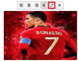
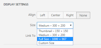
Then in the Size area you choose the image size you want (Full Size means the full size / Custom Size is to edit the size as you want):
In addition, you can adjust the image so that it aligns to the left, center or right, ie the icons will align to the word Edit when you click on the image.
I wrote a very detailed article on how to manage and manipulate images in WordPress with more details on this and related issues.
4. Visual / Text or Visual / Text
By default, your editing interface is Visual (Vietnamese WP) which corresponds to Visual (WP English), as this is the most convenient editing method for most users.
If you click Text or Text, it will switch to the source code based editor. This one looks pretty weird like this:

So what is its effect?
One of the commonly used effects is inserting music and videos into WordPress , because the procedure to insert music requires copying the embed code from another page, so you need to switch to Text to paste it.
In addition, some adjustments that you find difficult with the Visual / Visual interface, please convert it to Text / Text to fix, for example, the space error is too large (if you don't understand what this is, don't do it). worry) .
The next part should have been this:

But inside it only has some tools you use often, so I will talk about it later when necessary. We will continue to the bottom of it.
5. Section & segment articles with subheadings

Articles that want to be “readable” need to be divided into sections based on subheadings – they are still linked together, but the independence of each segment is easily recognizable. For example, this article you see it has items 1 to 5 (until the part you are writing is item 5.). You can imagine how difficult it would be to read without such a division.
Click on the icon above, you will see it pop up the following options:
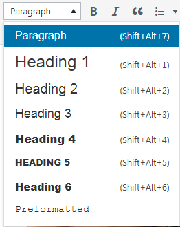
Explain:
- Paragraph : is a normal text. For example, the paragraph immediately below section 5: “Articles that want to be readable should be divided into…until…how” is a Paragraph.
- Heading 1 : Usually used as the title of the article. For example, the title of this article: A Guide to Editing and Editing Content in WordPress is Heading 1. Since each article should only have one Heading 1, you should not reuse it in the body of content.
- From Heading 2 to Heading 6 : you are free to use it in the body. Just remember that Heading 2 is more important than Heading 3 and Heading 3 is more important than Heading 4, etc. Also, you need to arrange the text with proper structure. Headings as subheadings will often make that text bold and larger than normal (paragraph) text.
- Formatted : It's a typeface that resembles the old typeface.
6. Basic operations

This part I talked about at the beginning of the article, later I will talk in more detail. Any text you want to edit (such as italics) needs to be hovered to scan the text, then click the icons above. It's very similar to MS Word (if you've ever used Microsoft's editor).
Some keyboard shortcuts:
- Bold : Ctrl + REMOVE
- Italic : Ctrl + I
- Underline : Ctrl + U
As for left, center, right alignment, this feature can be applied to both text and images.
Finally, a small note about the link. Your articles need to link together, it forms internal connections to help readers easily discover related content in the website. Or when you link to an external site to provide additional material to an existing post, you need to create the link as well.
How to create a link starts by scanning the text to link and then clicking the "chain" icon below:

A small window will appear like this:

Copy and paste the link into the box and press enter to confirm. Usually the link will change color like this to make it easy to distinguish and confirm that you have successfully inserted the link.
A small note when you point to external websites is to choose reputable websites with good content. Links to weak or spammy sites will negatively affect SEO.
To unlink, click on the link and then click the "unlink" icon as shown below:

Finished with the link, now we move on to another part.
If you make a mistake, you can undo the action. After going back multiple steps, you can also jump to the previous action, which can be done via the following icon:

In fact, this feature is very common and often uses keyboard shortcuts:
- Back then press Ctrl + Z
- Go ahead , press Ctrl + Y
7. Choose font, change text size & change font color
Font selection area and font size here:

On the left is the font name (named Libre Franklin), on the right is the font size (12pt).
The default font and font size will be decided by the theme, usually no problem but sometimes it makes the Vietnamese font not beautiful. You may then have to switch to another topic.
When you click on the font area, you will see a list of fonts appear as follows:
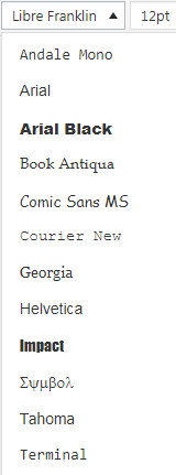
And you can choose the font you want.
Likewise when you click in the font size area, you choose the font size you want:
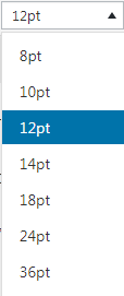
Note, changing the font and font size rarely works with Paragraphs (i.e. regular text), you only do this sometimes with subheadings – i.e. Headings or some document. other special editions on the site.
To change the font color, scan the text to be manipulated and then click here:
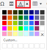
A palette will drop down and you choose the color you want: blue , red , purple , yellow , brown , black, etc.
8. Insert read more tag
If you don't include this tag in your article, the full content will be displayed every time the user enters the homepage or directory where they only need to see a small snippet of code before deciding whether to view the whole article or not. are not. or not. certain deck or not.
The task of the Read More tab is to interrupt the preview at the discretion of the editor.
During work, the editor places the mouse pointer where you want the break (usually about the first 10 lines) and then presses this button:

And on the editor there will be a small line like this saying you have done it successfully:

9. Insert a table into a post
Grids are also a tool that editors often use. To use the table, click the icon:

A pull-down rectangular box, you choose the table size as you want by hovering, there will be parameters displayed before the results for you, here I choose the table size is 3 columns x 4 rows:
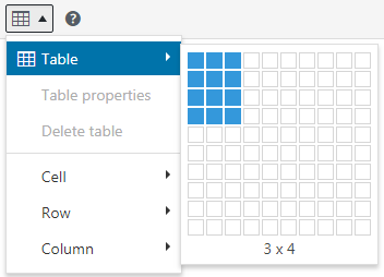
Result (data in table is data I added to make it easier to see):
| Column 1 | Column 2 | Column 3 |
| A | EASY | WOOD |
| REMOVE | E | H |
| OLD | F | I |
The way the table is displayed externally will depend on the theme type.
If you want to use a dedicated plugin to create beautiful tables, I've heard TablePress is great.
10. Some other odd features
Special characters, rarely used, but for some editors who may use it frequently, click here:

A window like this will pop up for you to choose from:
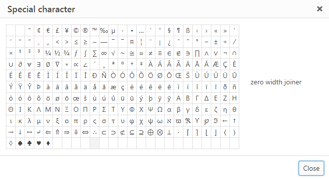
∪∂∅⊗⊇
That's what I just tried a few of the above.
Some other formatting changes:
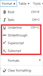
Above there are:
- Underlined
- Exponent: X 5 Y 3
- Chemistry: H 3 NO 4
11. Post articles / Publish
The content publishing area is on the right hand side, right next to the title area when you drag your mouse up.
It is located on a separate axis, below there are categories, tags, avatars that we will talk about shortly.
Back to the topic of this section, here's a screenshot of the Posts area:
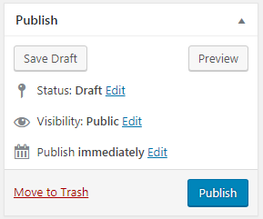
Some parts explained:
- Save Draft means saving the draft, you save the article for further editing at another time (for example, after a few days)
- Preview ie preview, you preview the article to see how it looks, this feature is not too useful because the visual tool while editing is also very good. But anyway this is the only way to help you emulate Publish so it is still useful in some cases.
- Visibility: Public This means you can make this post public once it's published, which means anyone with the link can see it. Normally, of course you should leave this as the default. Unless you just want to see your post, you can change it to Visibility: Private or you have to enter your password to see it.
- Publish immediately means publish as soon as you press Publish. Here you also have the option to schedule posts, such as exactly 1 week after posting.
- Move to Trash That means moving to the trash, which is equivalent to deleting the post, but the actual post is not deleted immediately, it takes a while to delete it in case you change your mind.
12. Select categories / Categories
In WordPress, categories (directories) are especially important. This is shown in that each article must be in a certain category, if you do not select it, it will be put in the Uncategorized / Uncategorized category.
Usually each blog writes about many different topics, and each of those topics is considered a category, where there are many related articles dedicated to that topic. For example, I have many articles about WordPress in a category named WordPress.
In fact, besides pages, categories are also often placed in WordPress menus to help users discover the content on the website more easily.
When you first write a post, the first thing you have to do is create a new category (Add New Category):
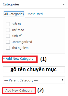
Type in the category name and then click Add New Category .
To select a category for an article you just need to tick the corresponding category.
13. Tags / Tags
The tag/tags adjustment area is right above the Profile Picture and below the Category.
Tags are a type of taxonomy a bit like a category in a sense, but created to save you from having to create multiple subcategories within a large category.
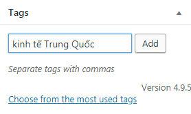
An example would be easier to understand. For example, if you have an Economics column, and you have hundreds of articles on this topic, of which you only have 9 articles on the topic of the Chinese economy, creating a separate category for the Chinese economy is not a good idea. China is not a good idea. China's economy is not enough. China will not be needed, instead you will create a China economic card for those 9 articles and users can still easily find these articles by clicking on the tag called: “Economic country China".
Adding tags is also very simple. You just need to enter the tag name and then click Add:
14. Profile Image / Featured Image
This is a function to create an avatar image for the article, usually this image will appear at the top of the article, and it is also the image displayed when you search in your contacts.
In the bottom right corner is where you choose your Profile Picture (at the bottom of the right column):
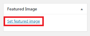
Uploading an image is very similar to a regular photo upload, you also have to type content for the Alt tag to optimize.
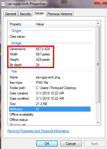
One small thing to watch out for is the image size. Since this is a profile photo, you'll need to keep the width to a minimum of 600px, and uploads (of different posts) should be relatively uniform in size (with the exception of some themes). has advanced features). high). tall is to automatically resize images so they appear equal in external view).
To know the size of the image, click on the image on your computer (Windows operating system), select Properties and then select Details to get the width & height of the image in px:
15. SEO
If you only care about creating content without caring about whether people read it or not, then you don't care about SEO at all. I know a few people like that, but most people for a variety of purposes want more people to read what they write.
Then SEO was there.
Regarding the WordPress-specific aspect, you should use an additional plugin called Yoast SEO to optimize your articles, the link I linked is an article on how to use that I wrote specifically for newbies. start blogging.
Goodbye and see you again.


