

Steps to draw a chart based on given data in Word 2013
- 24-07-2022
- trienkhaiweb
- 0 Comments
Drawing charts in Word is the way that many people use when presenting or reporting, especially for data tables. Because just one chart, you can represent many different objects in a way that is much easier to understand than writing text. So to learn more specifically about the charting feature on Word, I will make a specific example for you to refer to.
Draw a graph from a given data in Word 2013
In the previous post, I showed you how to insert and edit charts in Word . However, compared to inserting other tools, inserting charts requires you to perform more complicated problems. Therefore, today's article will show you how to draw a chart from a given table of data.
That data table is:
| Age group | New-born | Children | Youth | Youth | Adults |
| Ratio (%) | 8 | 23 | 25 | 24 | 20 |
To draw a graph, do the following in turn:
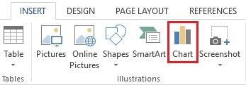
- Step 1: Go to the Ribbon toolbar, select "Insert Tab" , navigate to the "IIIustrations" command group and then select "Chart".
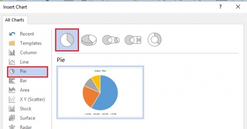
- Step 2: The dialog box opens, there are many types of charts in it. Since the data table has only one object, you can use a single column chart or a pie chart. Here, I click on “Pie” and select a pie chart and finally click on “OK” .
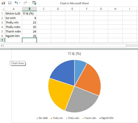
- Step 3: The chart is inserted into Word, and an Excel table appears. This is a table for you to enter data for charting.
In the first column of Excel, you type "age group" , the second column is "rate" , then you enter the groups of objects in the given data table corresponding to their data.
When you finish filling in, the chart has also divided into parts according to the proportions that you have typed in the Excel table. You turn off the Excel table.
- Step 4: Next, you edit the map.
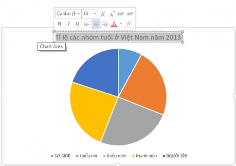
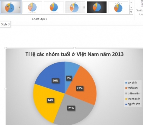
+ First you edit the title name, you just need to click on the "Chart Title" box, delete the chart title text and type the title name you want to type. Here, I will set the title of the map as “Proportion of age groups in Vietnam in 2013” . After typing, you highlight that line, a quick edit panel appears, you can edit the font, color, size of the text …
+ Second, when looking at the chart, you will not be able to determine how much this group occupies. Therefore, the next thing is that you have to attach the data to each corresponding part of the chart so that the viewer can easily recognize it. To add data, on the Design Tab, go to the Chart Layouts command group and click "Quick Layouts". Then, you click on any type, on the chart now allows you to enter the data, please enter the data in each corresponding box.
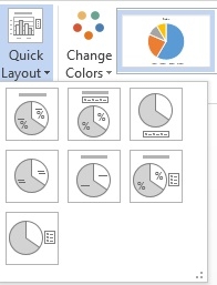
+ Next, if you feel unsatisfied with the chart style, you can go to the "Chart Style" command group to choose a Style with the best color.
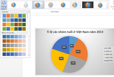
Or you can also change the colors with the “Change Colors” command.
Above, I showed you how to draw a complete chart step by step when inserting a chart in Word 2013 from given specific data. These are the most general steps you need to take when you draw a chart of any kind. Through this article, do you find drawing charts difficult or easy? I hope, for those who have not done how to insert a chart, the article will help you with that. Wishing you success.


